Oil painting course
Oil painting course
on the 4th and 5th of February 2017.
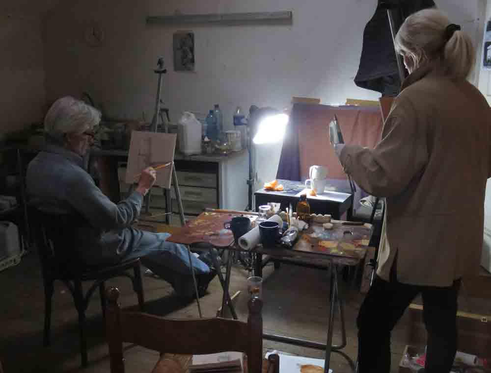
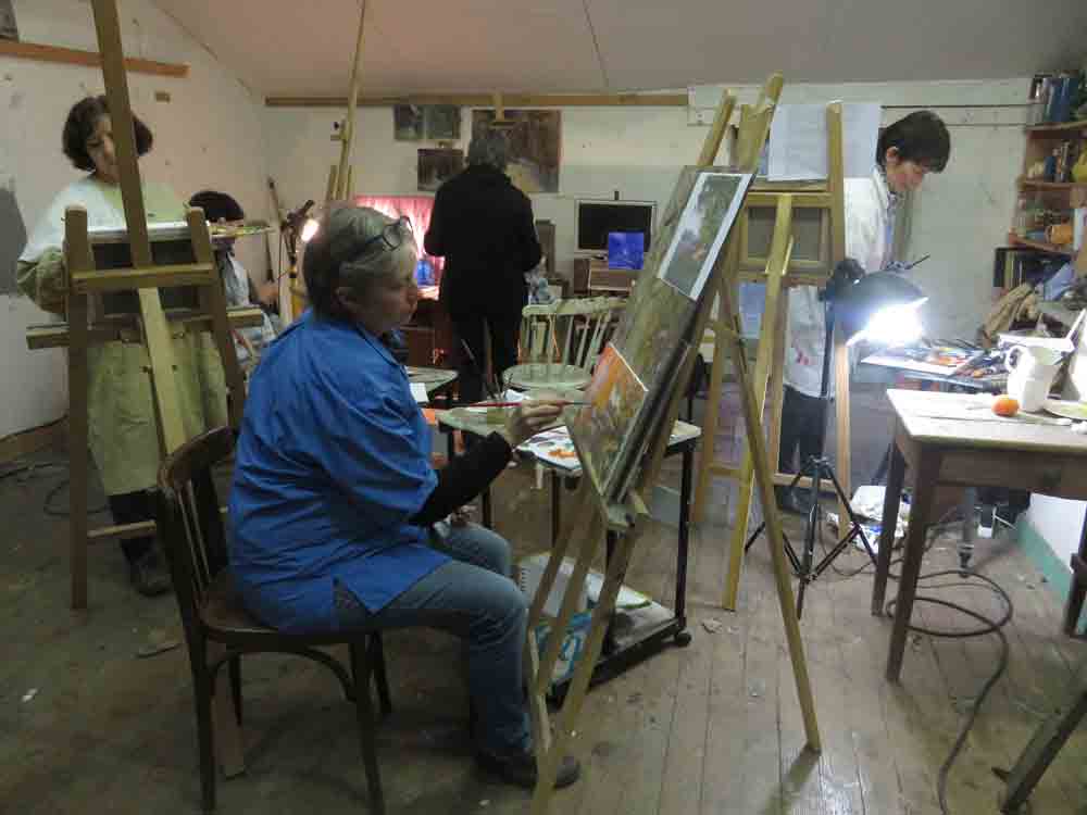
This was our first two day daily painting course in my studio at Catus. It was an intense and an enjoyable weekend.
Many participants were returning students who have already been to Catus for pastel workshops but were curious to try out a new technique, others were already experienced in oils.
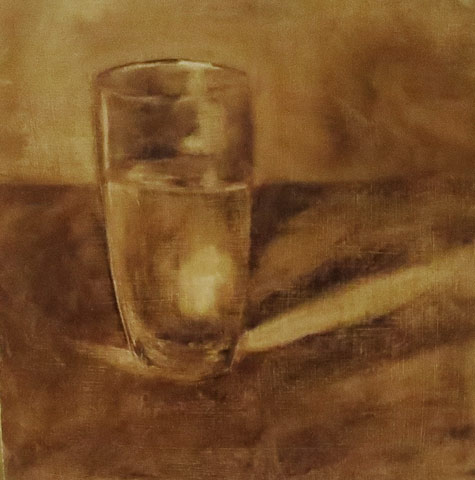
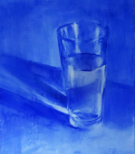
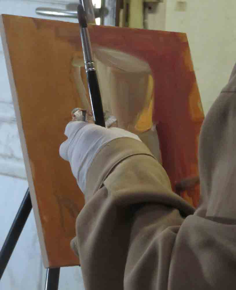
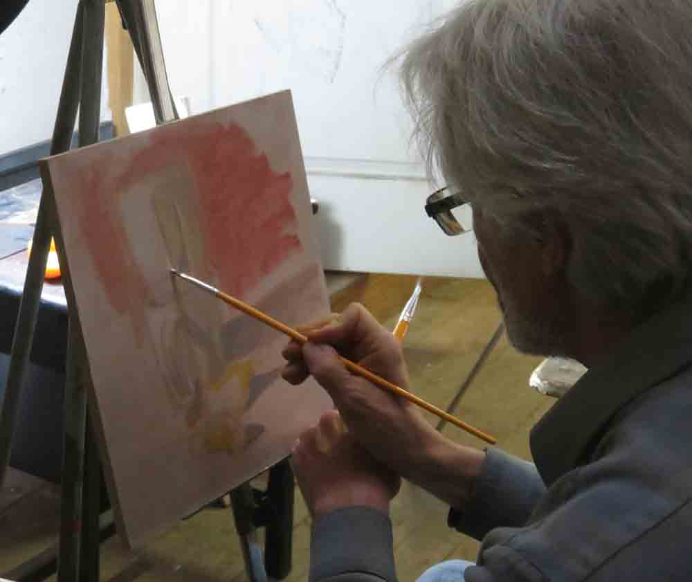
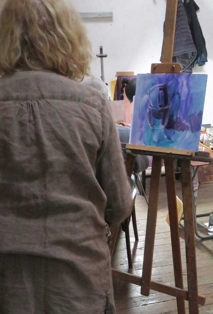
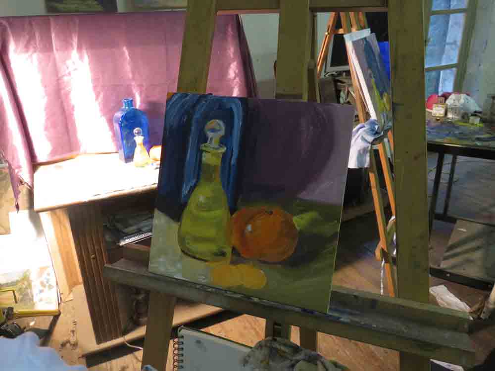
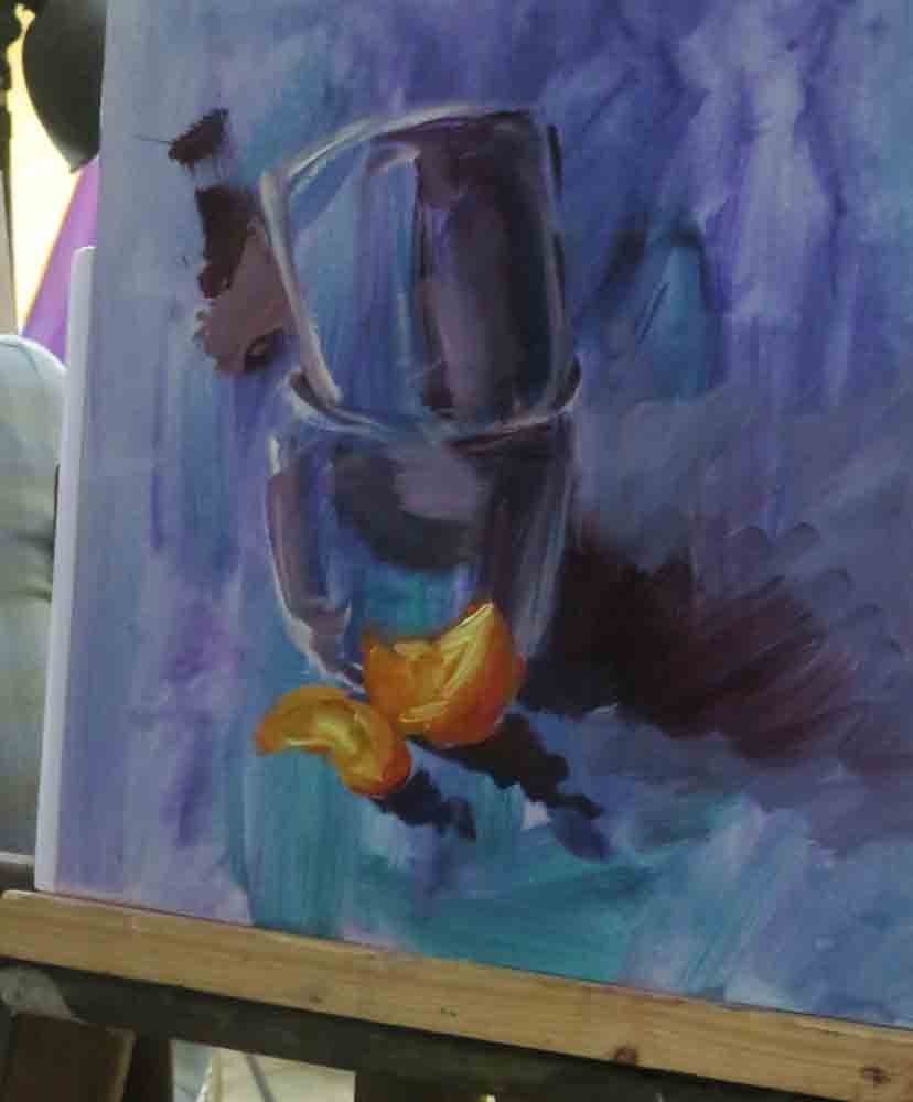
Because tone and colour can become so confusing, we started the oil painting course with a monochrome still life on a neutral background. We were working on primed square wood panels.
Even such a very simple subject as a glass of water can make an interesting image once strong directional lighting is added.
I love the purity of Artist Brian Blackham’s oil paintings: https://www.brianblackham.com/painting.php

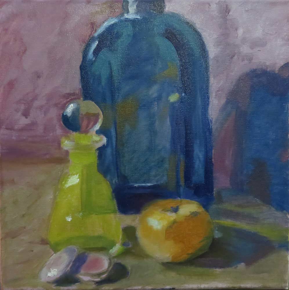
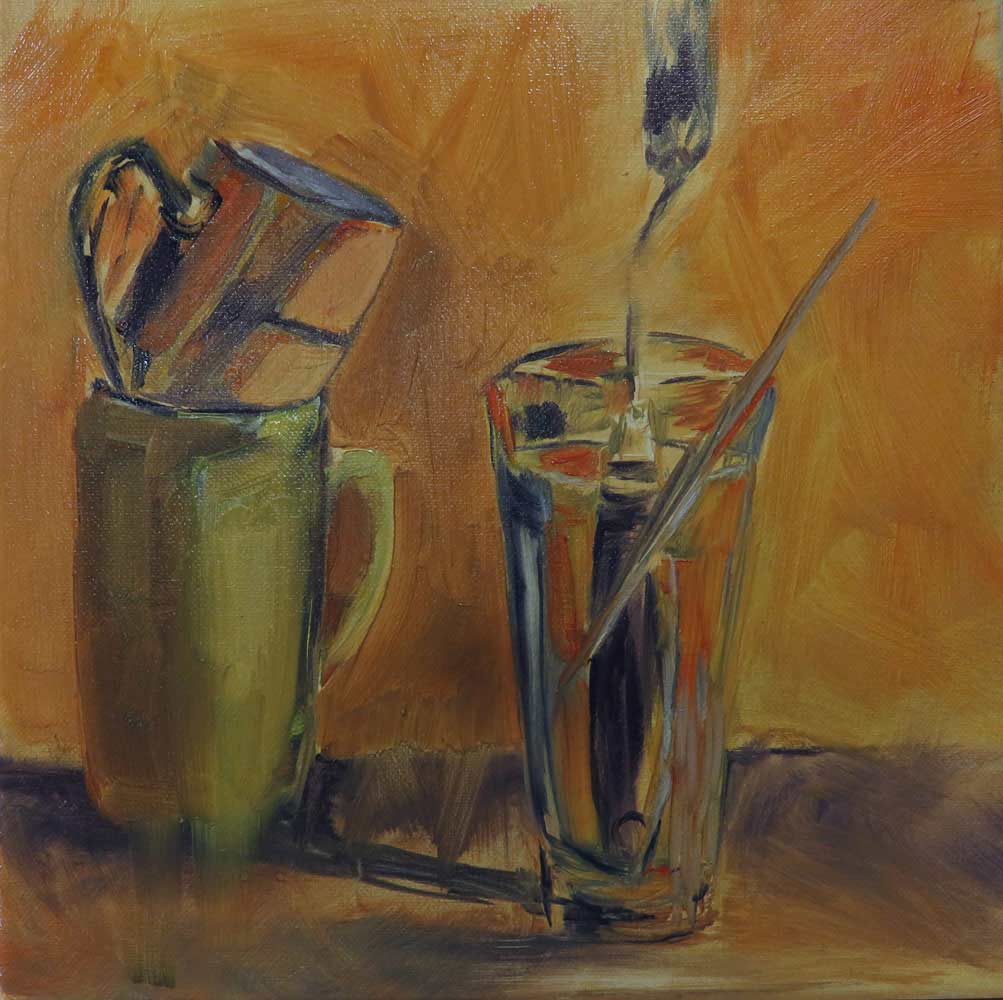
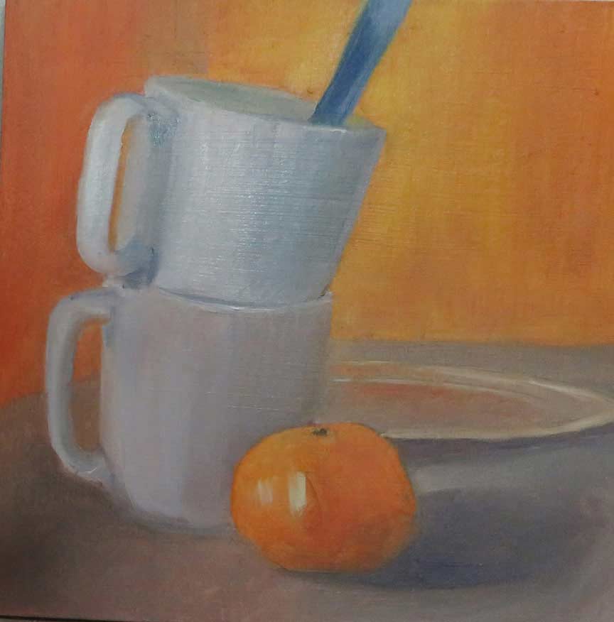
Here are four examples of the morning’s monotone oil paintings:


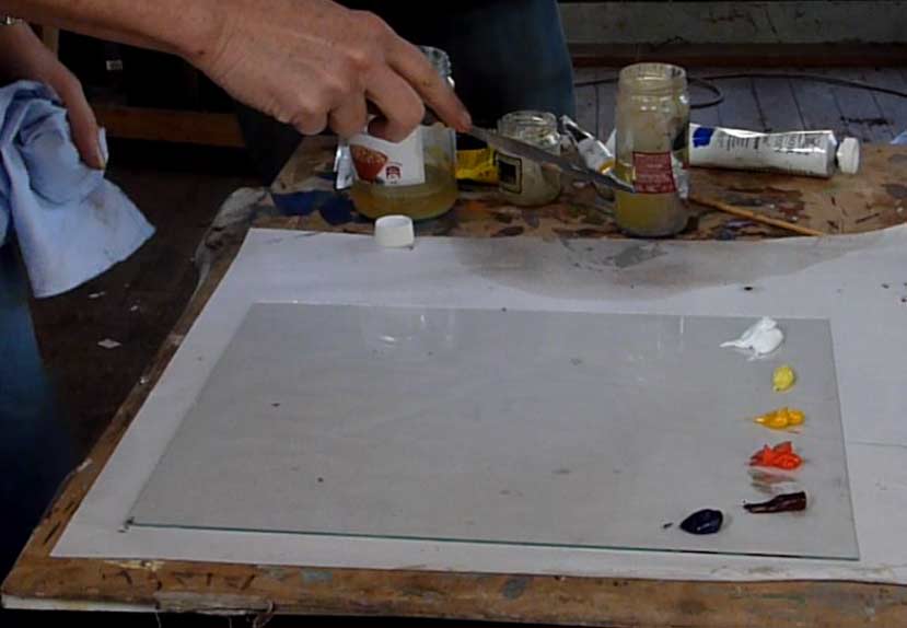
I had asked people to bring I greatly enjoy the process of oil colour mixing. It has become an important part of my working process, and I cannot imagine starting a painting without some time spent premixing oils on the palette.
I was influenced in this after reading the excellent book ‘How to see colour and paint it’, by the American artist ‘Arthur Stern’ published in 1988. https://www.amazon.fr/How-Color-Paint-Arthur-Stern/dp/1626540632
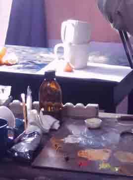
All premixing is done with a palette knife and on a large surface. Glass is ideal, it is smooth and also easy to clean at the end of a painting day.
For beginners, I always suggest limiting their colours down to 5, plus white. (Arthur Stern also adds phylo blue and phylo green.)

1)Ultramarine blue
2)Cadmium red light (or an equivalent rich red such as vermillion, cadmium having become a very expensive pigment)
3)Cadmium yellow light(or windsor yellow)
4)alizeron crimson
5)lemon yellow
plus white

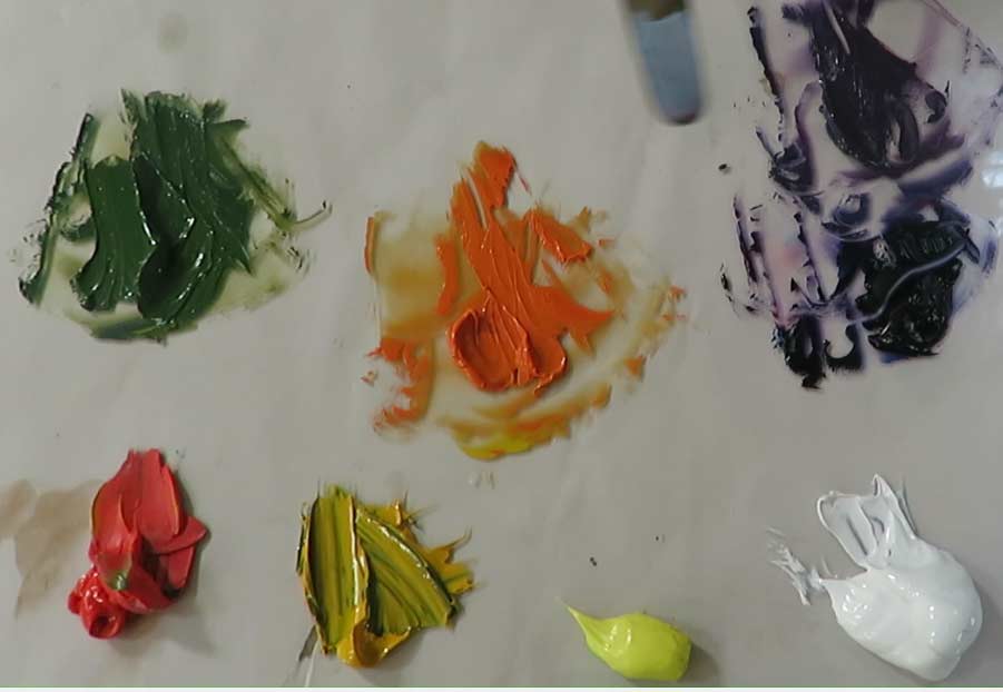

Using these primary colours we can make secondary and neutral colours.
Mixing the colour that you see can be helped with the use of a spot screen. A hole in a peice of card which must be held up at arm’s lenght towards the subject in order to isolate an area of colour, then ‘name’ it. Not ‘brown’ or ‘grey’, but something like: light/dull/violet. Then, by starting with a combination of alizeron crimson and ultramarine, add a little yellow added in bit by bit (the complementary colour) This ‘dulls down’ the violet as it heads towards grey. Later white can be added to lighten the mixture.
I have made a first basic video to show this process:


aperitifs before lunch
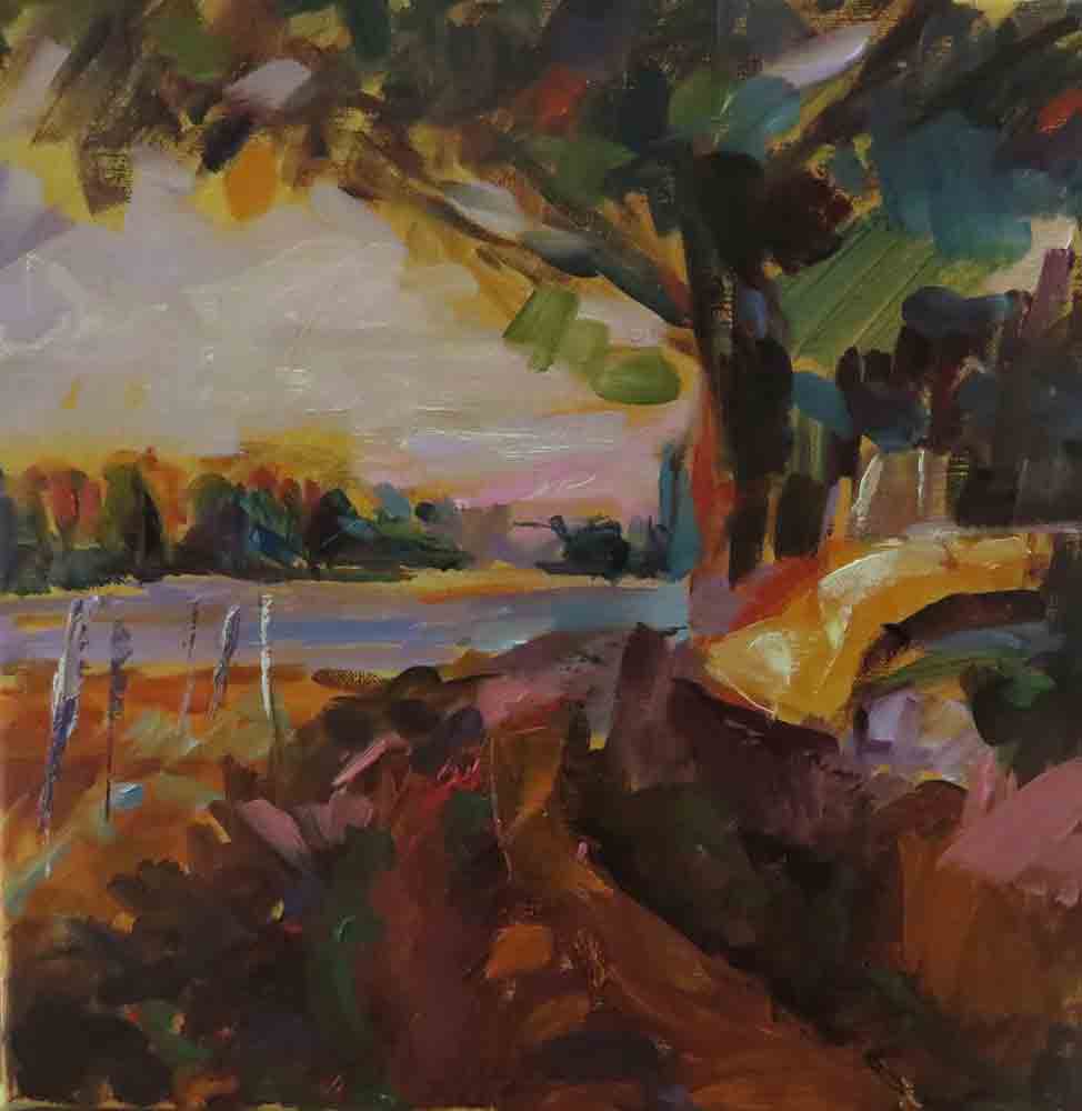
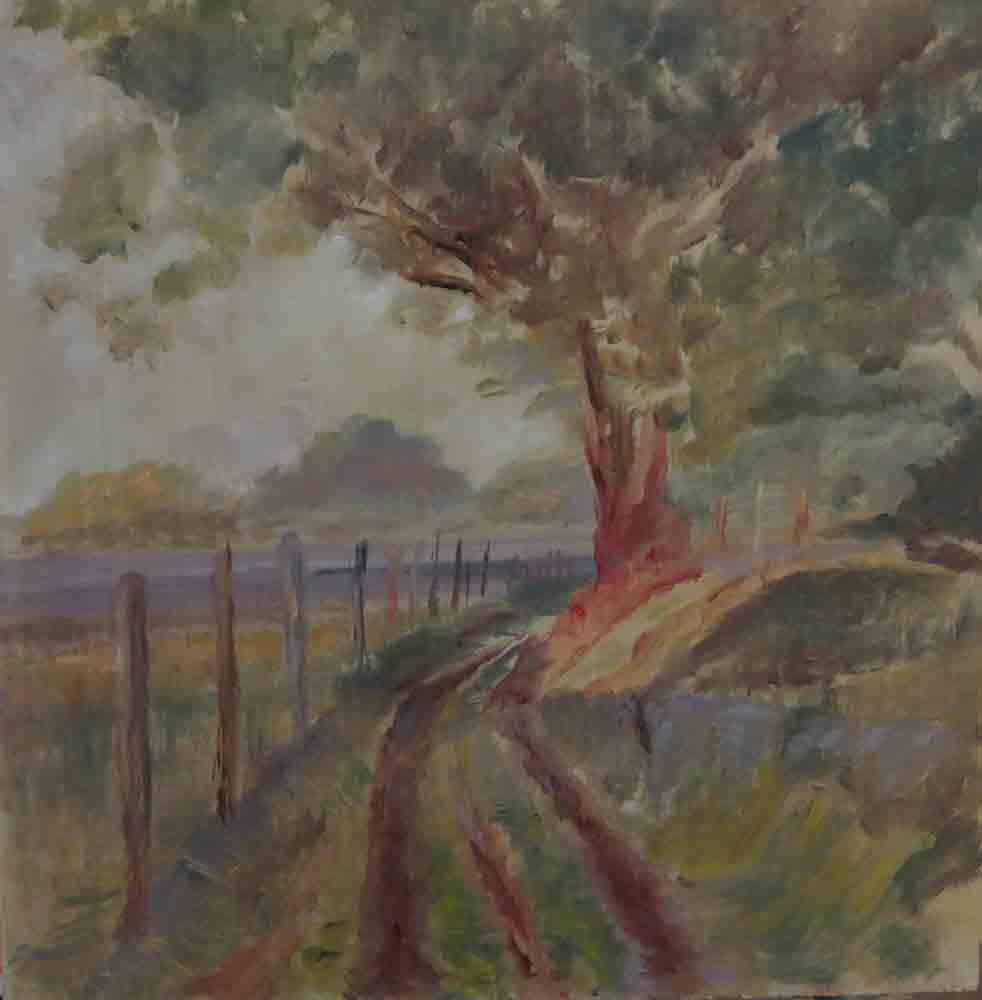
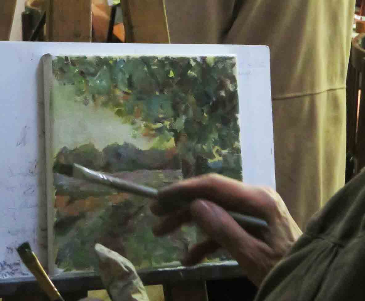
After lunch on the second day, I did a 20 minute demonstration, working from a photo of a footpath at sunset, after which, as so often happens, the students worked with an incredible speed on their own versions:


 Previous Post
 Next Post