Setting up
Setting up the scene can take quite a bit of time. Don’t rush the process and try to give yourselves the chance to see the scene at different times of the day and in different lights
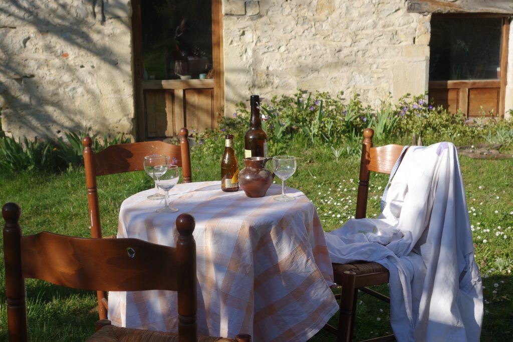
Once you are happy with the position of the table in front of the wall (interior or exterior) try placing different object on the table with various shapes and colours, but keep it simple. Try moving the chairs around too. However, it isn’t only the objects on the table which are important, we want to create a composition which includes the whole of the scene.
Using a view finder and doing thumb-nail sketches really help to frame your whole image. You want to simplify. By squinting at the view, one is able to see the large masses of shapes as a whole rather than focusing on the details. Practice doing this, so that the scene is blurred. One becomes more aware of ‘tone’, the light and dark areas and less aware of colour.
A successful painting has a balanced tonal composition.
Try taking a photograph and exaggerating the contrast then looking at it upside down, helping you to judge the relationship of light and dark areas in an abstract way……
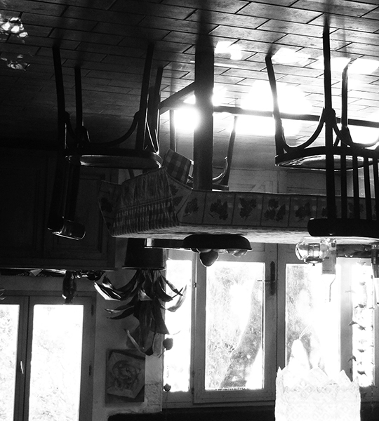
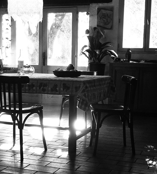
Consider, before starting the picture, how much space you want around the focus of the table, and how much of the wall to include. Don’t be afraid to cut the chair in the foreground for instance, if the space under the table isn’t very interesting and doesn’t add to the balance of your picture as a whole. You don’t necessarily want to go down to the bottom of the foreground chair legs. People will still know it’s a chair!
.Even once the table and chairs are placed in front of the wall, where we choose to position ourselves changes the relationship of the shapes radically.
Beginning the painting
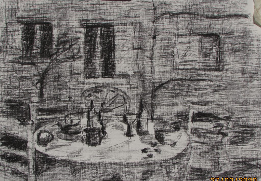
I give myself a structure for my image by measuring some of the main proportions and then marking down these proportions onto the pastel card.
Of course, it is very important to be sure that your sketch composition corresponds to the proportions of your paper!
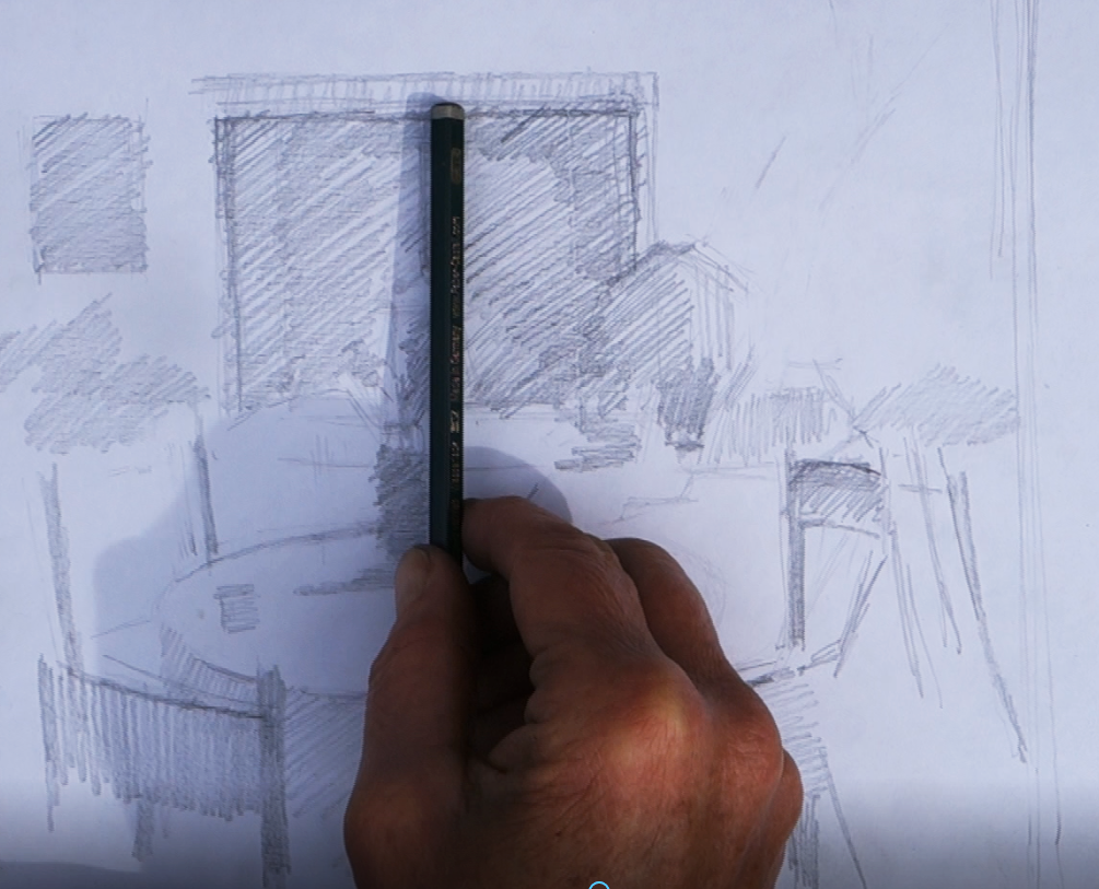
Once I have this grid in place and added some of the important structural lines, I begin the pastel.
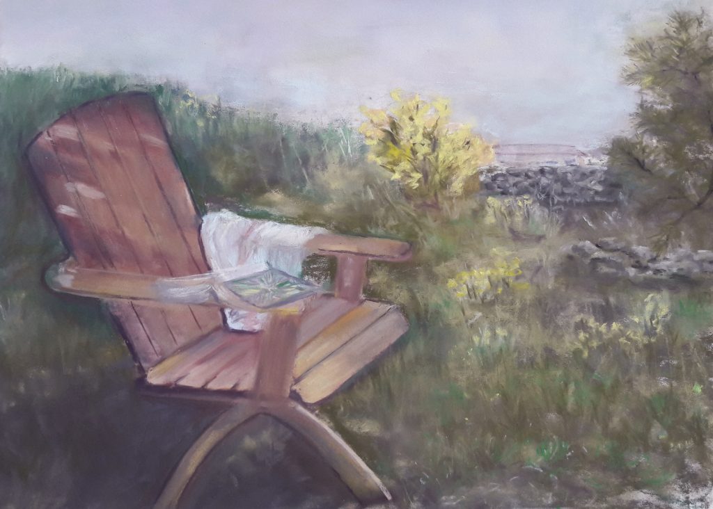
under painting
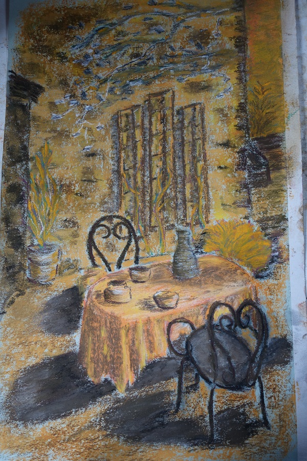
Working on a mid-toned paper, makes judging the tonal values easier.I am using salmon coloured pastelmat card.
I like this surface, it is smooth enough to show the mark-making, it takes many layers before it is saturated, and also it can take water based paints as under painting.
Start by blocking in the darkest and lightest masses. This can be one either by cross-hatching with the tip of the pastel, or by using the side. At this point in the picture, don’t think too much about colour, just how comparatively light and dark areas are. The pastel batons that you use do not want to be too far removed from the colour of your pastel paper, if you are using green paper, for instance, don’t do in and use a complementary colour in the red spectrum in this early stage.
Keep an area on the side of the paper free to test your pastels when you choose them from the box. Stand back and judge whether they are darker or lighter than the paper, also, if their colour jumps out at you, or harmonises nicely. Our first choice is the colour of the paper and to a large extent this dictates the over all colour relationships in the picture. If you are constantly fighting against the background colour, you will find yourself trying to cover it over, rather than building up gradually.
Before I think about detail, I want to work all over the whole image, relating one area of mass to another, so that as I stand back and look at the whole, the image is lightly sketched in, with the darkest areas darkest, and the lightest areas lightest. I may vary the intensity of certain lights and darks in order to adapt to the needs of the picture. and when I talk about an area, it’s not necessarily a ‘thing’ but may well be an area where two things next to each other are roughly the same tonal value.

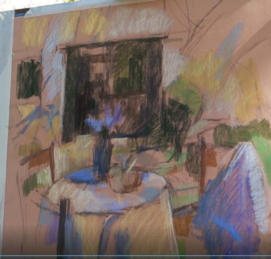
Here, for instance, the dark side of the bush visually joins the dark of the door, making one shape, and this is actually more interesting because it breaks the hard lines of the rectangle. Also, the dark of the vase pushes up into the dark of the door, giving a link between the foreground and the background. The light tone on the table is very close to the light on the ground in front of the door, and I’m aware as I’m working on it that this might cause me problems, but this is something I resolve later, mainly with a colour change between the two.
Colour
I believe it’s important to have a range of light, spectrum colours, at least yellow pink and blue. By mixing and cross hatching these, you can create a far more vibrant light than a pure white pastel.
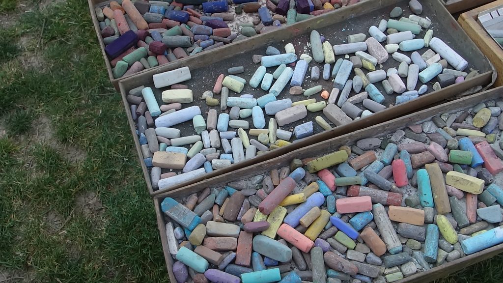
Equally with the darks; browns and violets can be pushed into blue is they are all of the same tonal intensity. This adds richness to your colour.
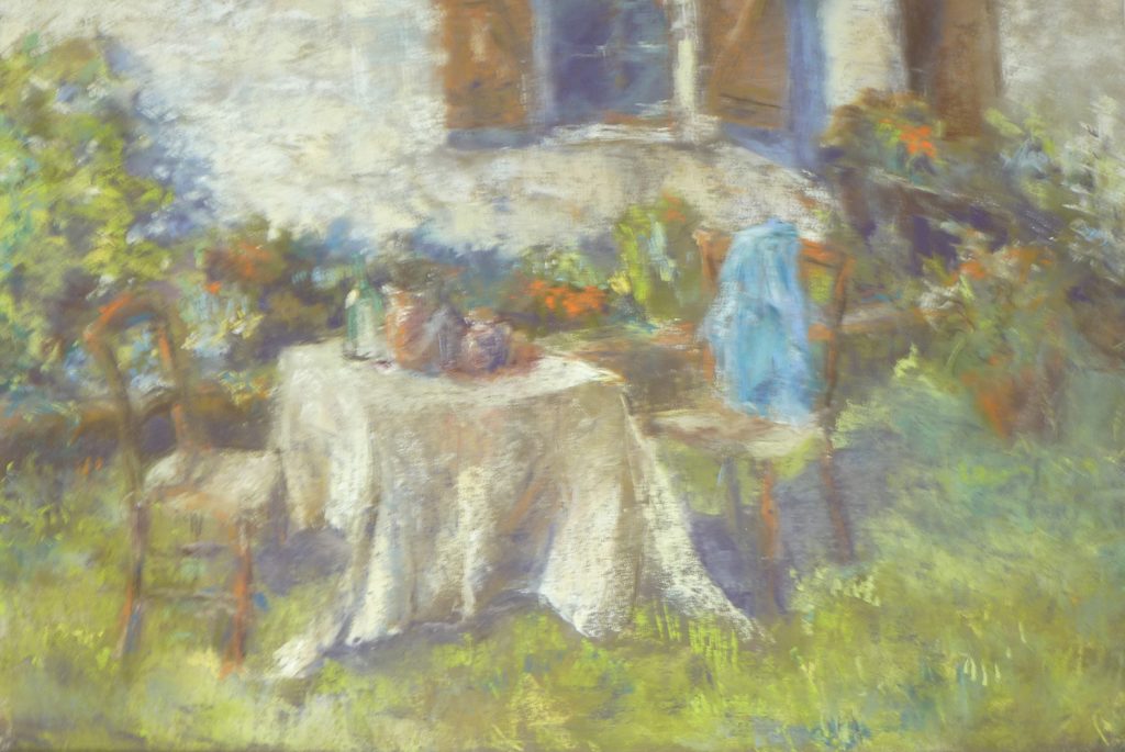
Here I am aware that I have two dominant colours right from the beginning of the painting, the salmon of the paper and the violet blue of the lilacs. Where these colours are appropriate I use them. And if you look closely at the painting you can see that I leave the paper visible where I can
after using a pasteI I put it to one side and in this way I gradually build up my palette and I know to reuse those colours whenever possible.
As pastellistes, we don’t have a way to mix colour on a pallet, if we mix, it needs to be done on the picture. Continuing to respect the darkness or lightness of an area I can add blues into mauve for example or yellows into Green. Be careful about using contrasting colours over each other though, or mixing too much, the colour can become muddy, this is why I believe that it’s better to limit your palette if you can, and keep to one side the pastels you have used.
being an artist
Although many of these decisions are made, there is a point where you are observing and concentrating and hopefully absorbed in the painting process. Keep your mind open and let the elements of intuition come into play, but try to get into the habit of standing back frequently, to scrutinise your work and see where it’s taking you.
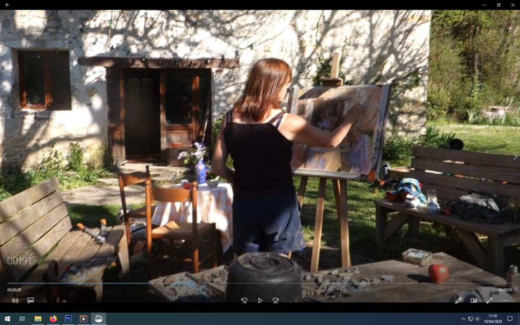
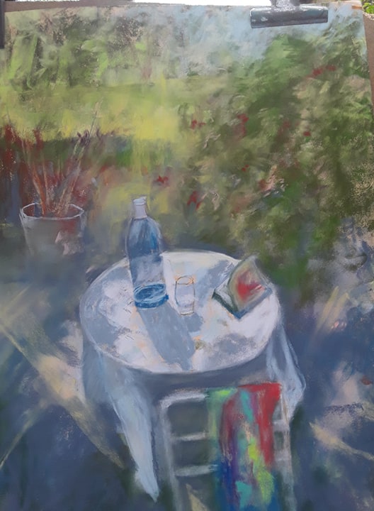
When you are working from life, the light moves and there is no fixed ‘reality’ A pleasure of working in several sessions like this is that it gives you the time to watch what is happening. The shadows on the wall for instance, changed shape constantly and I was free to choose their position to balance the over all image.
Try not to become too seduced by the focal objects too early on. I always suggest that when you have a pastel in your hand, search to find another corresponding area elsewhere to place it, this way you will be constantly moving and circulating around the picture and I believe have a better chance of keeping to one harmonious whole.
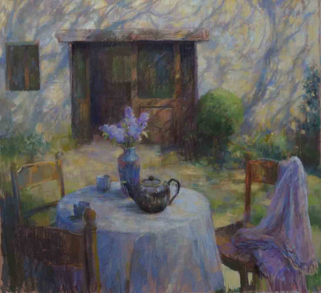
‘When is a picture finished?’ This is a difficult one! By working in stages as I generally do, I have time to consider the picture before working on it the next day. As I am painting, I become aware of areas that need to be ‘resolved’, in this demonstration it was particularly the shape of the dressing gown and the problem of separating the table top from the ground behind which posed problems early on. I was able to think about these and resolve them, so that by the last session I could have the pleasure of enjoying the dark teapot and adding final details.
I hope this article has been useful. Please give me feedback and let me know what you think.
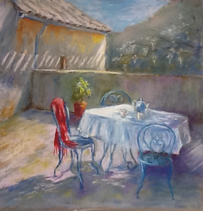
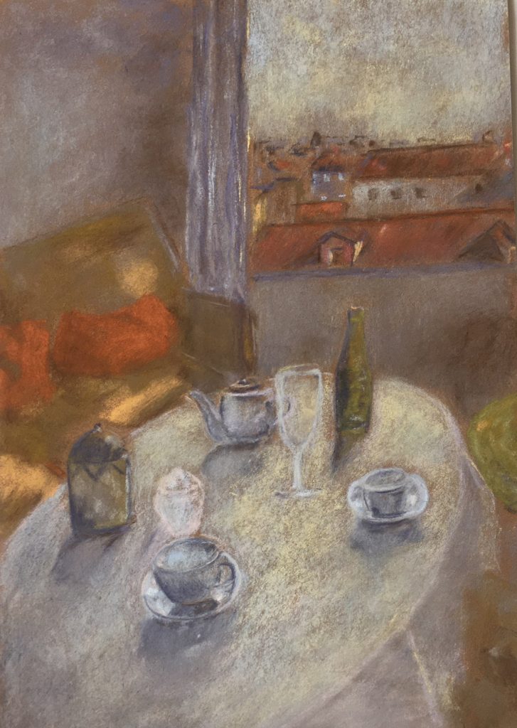
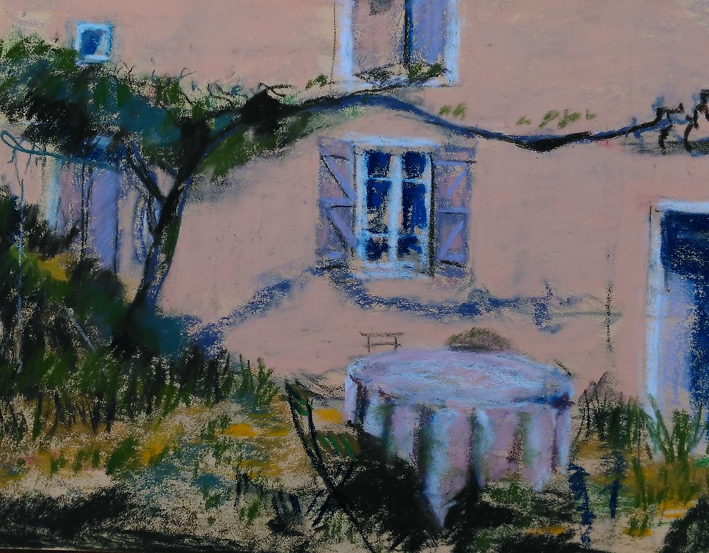
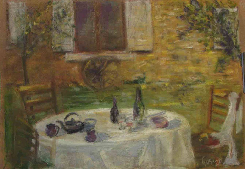
lastly, to inspire you with more ideas on this theme, I am including a gallery of pastels done by some of my students, all currently in isolation in their own homes.